
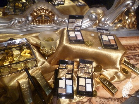
King Midas has been hard at work at Kate turning all the eye shadows into gold. At the launch of Kate’s Spring/Summer 2013 Collection, the room where the products were displayed was turned into a Baroque fantasy with gold touches everywhere we looked. It was almost like attending a Venetian masked ball within a palazzo. There were masquerade masks and peacock feathers surrounding the products.
All very appropriate for Kate’s latest eye shadow palette collection this season called KATE GOLDISH EYES. If you love gold eye shadows and I don’t just mean gold in colour but shadows with gold undertones and with loads of shimmer, then this is the collection for you.
BU-1, WT-1, PK-1, GD-1 KATE GOLDISH EYES
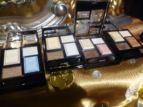
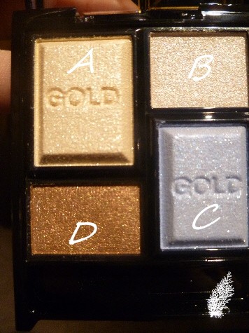
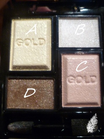
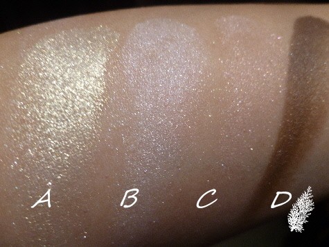
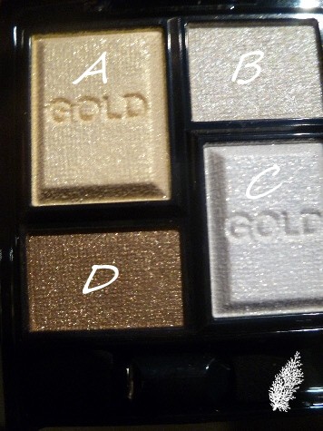
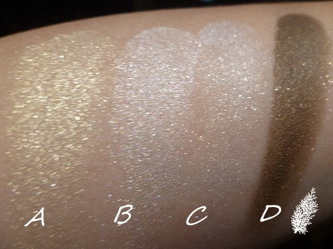
Gold isn’t just the predominant colour of the shadows. Gold is also part of the formula as the shadows contain two unique gold pearl powders – Real Gold Pearl, a pure gold pearl powder with 0.1% 24k Real Gold and Nuance Gold Pearl, a bright pearl powder with a hint of gold. In each palette, the Real Gold Pearl is in the shadow on the top left hand corner and the Nuance Gold Pearl is in the shadow on the bottom right hand corner of the palette, i.e. the shadows marked ‘A’ and ‘C’ respectively in the images below.
KATE GOLDISH EYES (4 shades) RM59
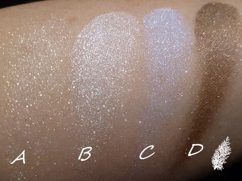
BU-1
BU-1 palette is the only palette with a baby blue shade in it and it’s this shade that contains the Nuance gold Pearl. I like shade D as it’s a dark brown with gold shimmer. There are 2 shades which can be used as highlighters – shade A and B.
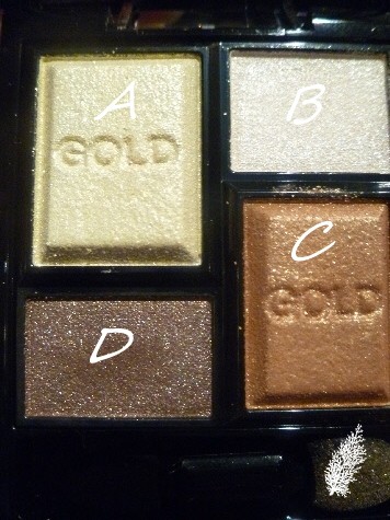
GD-1
GD-1 palette might just be most people’s favourite palette as it has some lovely neutral shades. However, I think the D shade in this palette has less gold undertones than the D shade in the BU-1 palette. This is the palette used on the model during the make-up demo. I like shade C the most as it’s like a bronze gold. Frankly if I didn’t know any better, I’d have thought these were counter brand eye shadows, they are smooth and as another media person pointed out, so buttery to the touch.
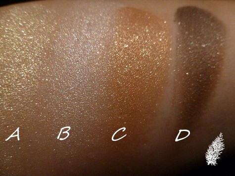
PK-1
PK-1 palette has mainly pastel shades and the pale pink doesn’t show up much on my skin. This is my 2nd least favourite of the palettes as the shades are not exactly outstanding. The A shade in this palette also pales in comparison to the more vibrant yellow gold (shade A) in GD-1 palette.
WT-1
My least favourite palette, too washed out although I am sure some ladies can pull off such shades with more panache than me.
The shadows can be applied with the sponge applicator or with fingers. If you use your fingers, you will get a smoother and more polished effect. How to apply the shadows in the palette? Here’s Kate’s guide:-
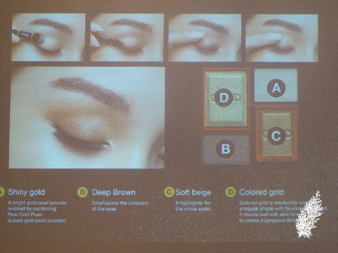
Based on the A, B, C and D marked in the image above :-
- Take A on the larger tip of the applicator and spread it over the whole eyelid to make the eye look radiant.
- Use the finer tip of the applicator to blend B as if drawing a line along the edge of the upper eyelid, in order to highlight the contour of the eye.
- Take C on a fingertip and while blending it with shade B, apply it to the eyelid crease under the eyebrow.
- Take D on a fingertip and adjust the intensity on the back of the hand. Then apply it over shade C.
As Kate products are sold in drugstores, the products are designed to be fool-proof so that even beginners to make-up can use them with confidence and ease.
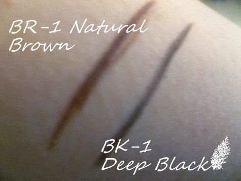
KATE SLIM GEL PENCIL (2 colors) RM44
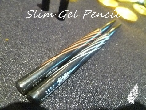
These 2-mm diameter pencils are fragrance-free and claim to be waterproof (sweat-, water- and sebum-resistant). Has a special holder to protect the gel pencil stored inside and allows fine lines to be created. The gel pencil can be twisted in increments of 0.07 mm for fine pencil adjustment. This prevents too much of the pencil from being let out of the holder. The pencil cannot be twisted down.
With its fade-resistant gel formula, the pencil is designed to cause pigments to easily adhere to the skin and contains a large amount of water-repelling pigments. As a result, the pencil has high water resistance. BK-1 contains black pearl to enhance the depth of the shade so you get a gel-like luster and a very dark black. Apparently, this is THE eyeliner pencil to go for if you are accepting an award or giving a speech as even the people from the back can observe how very black your liner is!
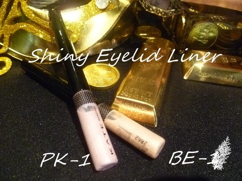
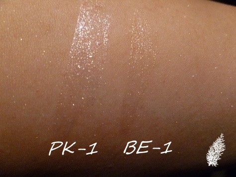
KATE SHINY EYELID LINER (2 colors) RM44
Now this is the most interesting and innovative product in the collection, in my opinion. The eye shadows are too shimmery for my taste and I am hopeless at eyeliner anyway but an eyelid liner is different, I just might have a chance at making this work on me.
This product is for the lower eyelids and there are 2 shades. The brush is very fine and allows for easy adjustment of the amount of the fluid. Why do we need an eyelid liner? Well if we want our eyes to look bigger and more arresting, then we need all the help we can get at making our eyes the focus of everyone’s attention and Kate’s Spring/Summer 2013 Collection is all about the eyes. There are no blush or lip products unlike last year.
The 2 shades are PK-1 for adorable looking eyes and BE-1 for natural looking eyes. I happen to have BE-1 so anyone want a review? This eyeliner is used from the inner corner of the eye toward the center of the eye. It’s designed to make the lower eyelid look more contoured and full. Call it an optical illusion.
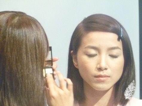
During the make-up demo, the make-up artist used the GD-1 palette, Slim Gel Pencil BK-1 and Shiny Eyelid Liner PK-1 on the model and this is the end result:-
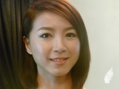
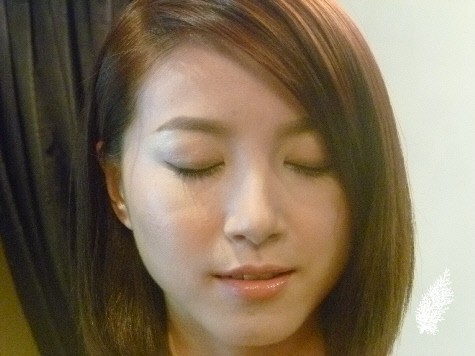
Initially, I thought there’d be way too much shimmer seen but surprisingly, the look is very natural and it’s an everyday wearable look for everybody. King Croesus would have been proud of this collection!Kate Spring/Summer 2013 Collection will be available in May 2013.


I am a fan of glitter eye shadows! I am getting GD 1 as according do your swatches, I like the deeper colours.
Good choice, that would be the palette I would go for too.